
Picker Label Alignment
Picker Label Alignment
One issue I have with some SwiftUI picker-style controls, such as ColorPicker, DatePicker, and Toggle, is that they are basically label/content views. The label is aligned to the leading edge and the control itself is aligned to the trailing edge, often leaving more space between them than I want.
For example:
VStack { ColorPicker("Select Color", selection: $color) DatePicker("Select Date", selection: $date) Toggle("Power", isOn: $isOn)}By default, SwiftUI renders them like this:
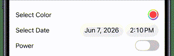
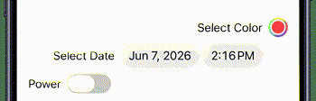
But I might want to tighten up the space between the label and the control, and also specify the alignment. For example, here are the same three controls with the first using trailing alignment, the second using center alignment, and the third using leading alignment.
Using HStacks and Spacers
In my experience, most people would solve this by hiding the existing label with .labelsHidden(), embedding each picker in an HStack, adding a replacement Text view for the label, and then using Spacer views to get the desired alignment.
VStack { HStack { Spacer() Text("Select Color") ColorPicker("Select Color", selection: $color) .labelsHidden() } HStack { Text("Select Date") DatePicker("Select Date", selection: $date) .labelsHidden() } HStack { Text("Power") Toggle("Power", isOn: $isOn) .labelsHidden() Spacer() }}This works, but the main issue for me is that I am duplicating the label string.
The tendency might be to use an empty string for the picker label:
ColorPicker("", selection: $color)However, if you provide an empty string, VoiceOver has no useful label unless you supply one another way.
A better solution
A better solution is to remove the spacers altogether and use a frame with a maxWidth of .infinity and an alignment for the edge you want.
Since the default alignment is center, there is no need to add a frame to the DatePicker.
VStack { HStack { Text("Select Color") ColorPicker("Select Color", selection: $color) .labelsHidden() } .frame(maxWidth: .infinity, alignment: .trailing) HStack { Text("Select Date") DatePicker("Select Date", selection: $date) .labelsHidden() } HStack { Text("Power") Toggle("Power", isOn: $isOn) .labelsHidden() } .frame(maxWidth: .infinity, alignment: .leading)}This is better, but it is still a lot of code and it still does not solve the issue of duplicating the label.
Instead, you can remove the HStack views altogether, along with the corresponding Text views, and apply the frame directly to the picker-style controls.
VStack { ColorPicker("Select Color", selection: $color) .frame(maxWidth: .infinity, alignment: .trailing) DatePicker("Select Date", selection: $date) Toggle("Power", isOn: $isOn) .frame(maxWidth: .infinity, alignment: .leading)}But now we are back to the same issue we had before, where the picker takes up the full width of the enclosing view.
There is a simple solution and that is to apply a fixedSize() modifier to the picker before the frame.
VStack { ColorPicker("Select Color", selection: $color) .fixedSize() .frame(maxWidth: .infinity, alignment: .trailing) DatePicker("Select Date", selection: $date)÷ .fixedSize() Toggle("Power", isOn: $isOn) .fixedSize() .frame(maxWidth: .infinity, alignment: .leading)}
Now the controls only take up the space they need, while the frame controls the overall alignment.
Create A ViewModifier
If you use this technique a lot, you would be wise to create a ViewModifierand a corresponding View extension
struct EdgeAligned: ViewModifier { let alignment: Alignment func body(content: Content) -> some View { content .fixedSize() .frame(maxWidth: .infinity, alignment: alignment) }}extension View { func edgeAligned(alignment: Alignment) -> some View { self.modifier(EdgeAligned(alignment: alignment)) }}With the extension, we can apply the modifier directly to any picker-style control and just specify the alignment.
VStack { ColorPicker("Select Color", selection: $color) .edgeAligned(alignment: .trailing ) DatePicker("Select Date", selection: $date) .edgeAligned(alignment: .center) Toggle("Power", isOn: $isOn) .edgeAligned(alignment: .leading)}